Climate Coup: The Science
April 22, 2012 2 Comments
We checked the climate models against our best and latest data. They got all their major predictions wrong—air temperatures, oceans temperatures, atmospheric warming patterns, and outgoing radiation.
By DR. DAVID EVANS | SPPI | APRIL 23, 2012
Introduction
Our emissions of carbon dioxide cause some global warming, and it has indeed warmed over the last century. But this doesn’t prove that our emissions are the main cause of that warming—there might be other, larger, natural forces on the temperature. The key question is: how much warming do our emissions cause?
Climate scientists use their climate models to estimate how much. In this article we check their main predictions against our best and latest data, and find they got them all wrong: they exaggerated the warming of the air and oceans, they predicted a very different pattern of atmospheric warming, and they got the short-term relationship between outgoing radiation and surface warming backwards. The latter two items are especially pertinent, because they show that the crucial amplification due to the water feedbacks (mainly humidity and clouds), that is assumed by the models, does not exist in reality. This amplification causes two-thirds of the temperature rises predicted by the models, while carbon dioxide only directly causes one third. This explains why the models overestimate temperature rises.
We check the performance of the climate models against impeccably sourced, publicly available data from our best and latest instruments. See the end notes for how to download the data yourself.
Checking the Theory of Manmade Global Warming Against the Data
The theory of manmade global warming is that the world has been warming for the last few decades, that this is almost entirely due to our emissions of carbon dioxide (CO2)2, and that the warming by 2100 will be a dangerous 3–4°C.
The theory is embodied in the climate models, which are used to predict the future climate. We will now check their predictions against the best and latest global data, collected by our most sophisticated instruments. The climate models have been essentially the same for almost 30 years now, maintaining roughly the same sensitivity to extra CO2 even while they became more detailed as computer power increased. So it is fair to compare their predictions from over two decades ago with what subsequently happened.
Warning, forbidden data: The data in this article is impeccably sourced, from our best instruments, and is publicly available. Yet none of it has appeared in the mainstream media, ever, anywhere in the world. This observation leads into the political argument in Climate Coup—The Politics. As you look at the data, ask yourself whether it is relevant and whether the media should withhold it from us.
Air Temperatures
The best sources of air temperature data are the satellites. They circle the earth 24/7, measuring the air temperature above broad swathes of land and ocean, covering all of the globe except near the poles, and are unbiased. Satellite measurements started in 1979; early problems with calibration have long since been resolved to everyone’s satisfaction. The data presented here comes from NASA satellites and is managed at the University of Alabama Hunstville (UAH).6 This is an impeccable source of data, and you can easily download the data yourself. The data is currently collected from this satellite:

One of the earliest and most politically important predictions was presented to the US Congress in 1988 by Dr James Hansen, the “father of global warming”. Here are his three predicted scenarios, taken from his peer-reviewed paper in 198811 and re-graphed against what the NASA satellites subsequently measured (all starting from the same point in mid-1987):
Hansen’s climate model clearly exaggerated future temperature rises.
In particular, look at his scenario C, which is what his climate model predicted would happen if human CO2 emissions were cut back drastically starting in 1988, such that by year 2000 the CO2 level was no longer rising. In reality the temperature is below his scenario C prediction even though our CO2 emissions continued to increase—which suggests that the climate models greatly overestimate the warming effect of our CO2 emissions.
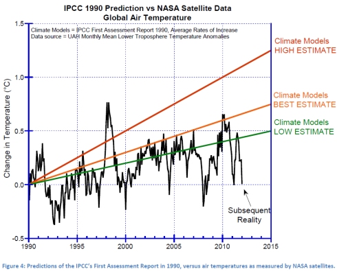
A more considered prediction by the climate models (and the earliest that cannot be wiggled out of) was made in 1990 in the IPCC’s First Assessment Report:

After 21 years, the real-world warming trend is below the lowest IPCC prediction.
Ocean Temperatures
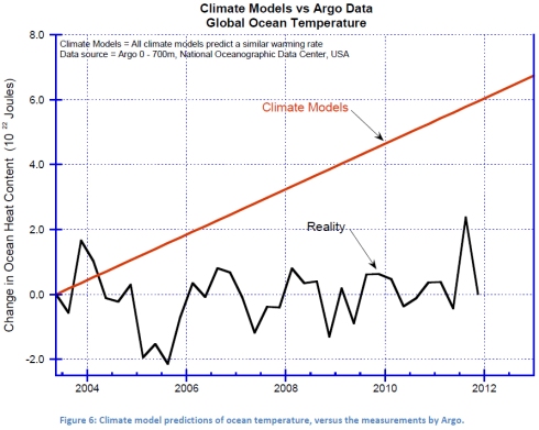
The oceans hold the vast bulk of the heat in the climate system. We’ve only been measuring ocean temperature properly since mid-2003, when the Argo system became operational.
Ocean temperature measurements before Argo are nearly worthless. They were made with buckets, or with bathythermographs (XBTs)—expendable probes that fall through the water, transmitting data back along a pair of thin wires. Nearly all measurements were from ships along the main commercial shipping lanes, so geographical coverage of the world’s oceans was very poor—for example the huge southern oceans were barely monitored. XBT data is much less precise and much less accurate than Argo data—for one thing, they move too quickly through the water to come to thermal equilibrium with the water they are trying to measure.
Argo buoys duck dive down to 2,000 meters, measuring temperatures as they slowly ascend, then radio the results back to headquarters via satellite. Over 3,000 Argo buoys constantly patrol all the oceans of the world.
The ocean heat content down to 700m as measured by Argo is now publicly available, and you can easily download the data yourself. Ocean heat content is measured in units of 1022 Joules, which corresponds to a temperature change of about 0.01°C. The climate models project ocean heat content increasing at about 0.7 × 10²² Joules per year.

The average sea level rise since 2004 is about 0.33 mm per year, or about 3.3 cm (1.3 inches) per century, which confirms the Argo message that the oceans haven’t warmed recently. In contrast, the IPCC in 2007 predicted a sea level rise of 26 to 59 cm by the end of the century if our CO2 emissions continue unabated, and Al Gore suggested in his movie that we might see a rise of 20 feet and half of Florida underwater.
Read Full Article →
